Description:
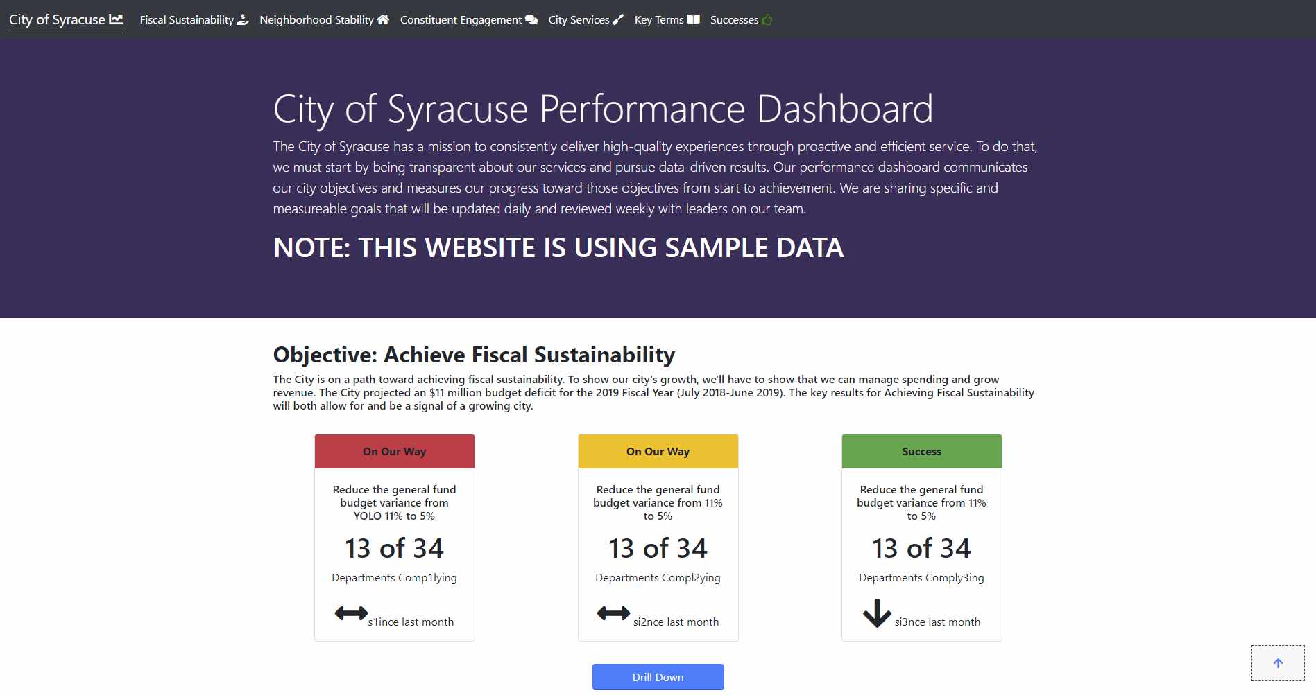
For an internship at the Syracuse Accountability Performance and Innovation ( Innovation team / iTeam) I was tasked with porting the current dashboard to something besides its current state of being 5+ individual R (R lang – data analysis language) scripts that would render the website. The goal was to make it easier to update the site. My implementation relied on hosting the site on Github pages, using ChartJS to create the graphs due to using SVGs it had a lighter performance hit than D3 based charting libraries. I worked with Jesse Cases a former data analyst on the Syracuse Innovation Team to understand how the dashboard was created and understand the major pain points in it. The major issue was the performance dashboard was 5 or more R scripts that had to be ran in a specific order to generate the HTML. So my thought upon hearing this was to create a static website that you could just change the data fed to it and it would update the dashboard.
Repository link — https://github.com/CityofSyracuse/PerformanceDashboard
Proof of concept website — https://cityofsyracuse.github.io/PerformanceDashboard/
Development:
Creating a data structure:
I created the data structures I envisioned for the site by having them broken up into separate CSV files. The way I constructed these files was using D3 to initially to parse a CSV data dumps into separate Objectives, main page, and key result banner data. Within each of these file is the following header:
1
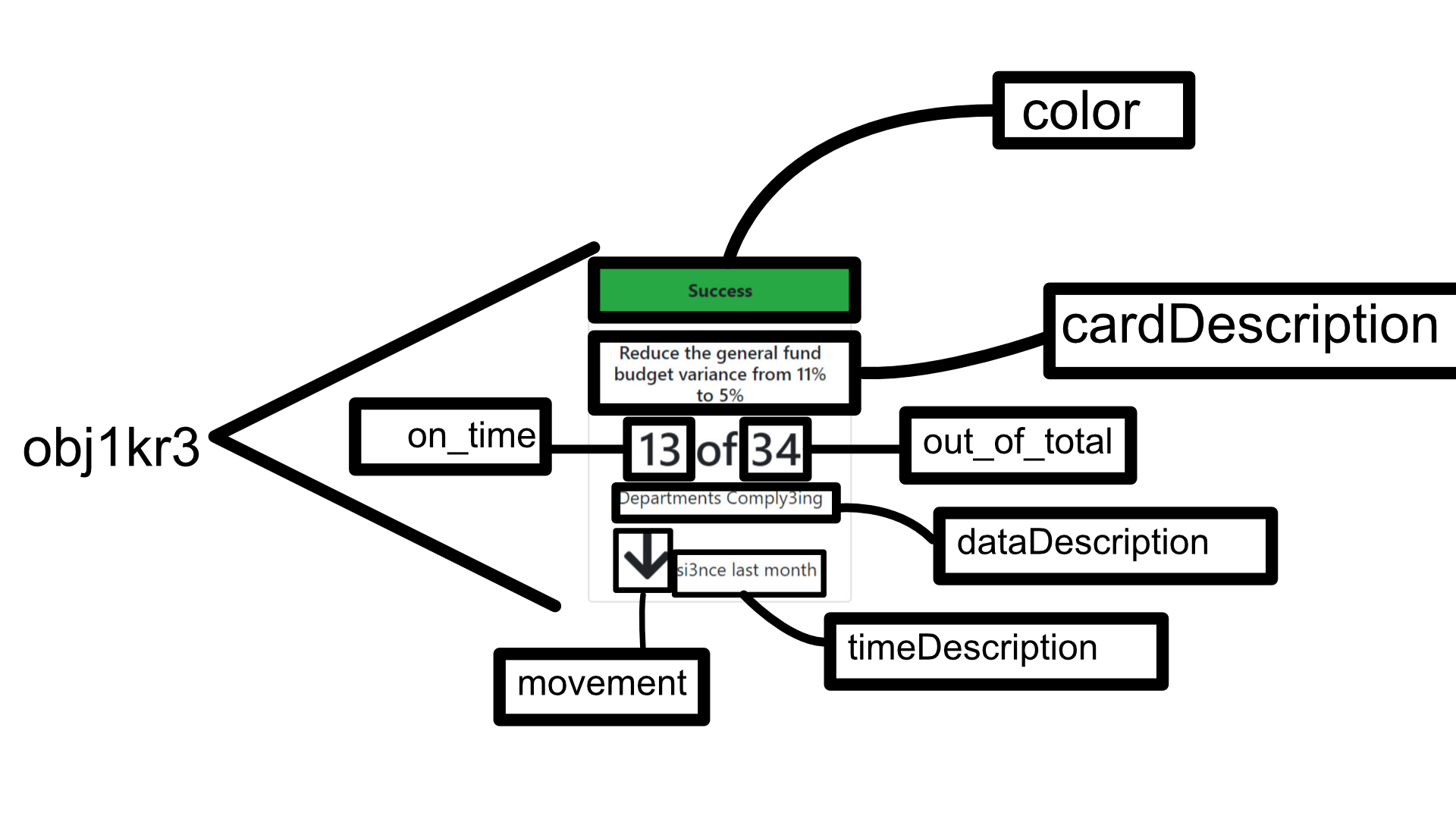
“obj”,”OKR”,cardDescription,on_time,out_of_total,dataDescription,timeDescription, movement,color.
A JavaScript script fetches that data and interprets it and fills it into the HTML template.
The two data points that are interpreted strangely are “movement” and “color”. If “movement” is:
1 – an arrow pointing “up” will be presented. 0 – a double horizontal arrow will be presented. -1 – an arrow pointing “down” will be presented.
If “color” is:
2 – the top rectangle will have a green background, and “success” will be shown. 1 – the top rectangle will have a yellow background, and “On our way” will be shown. 0 – the top rectangle will have a red background, and “Problem Solving” will be shown.
This data can be seen in this csv located on the Innovation Team repository: https://github.com/CityofSyracuse/PerformanceDashboard/blob/master/data/mainPageData.csv
Key result data points structure:
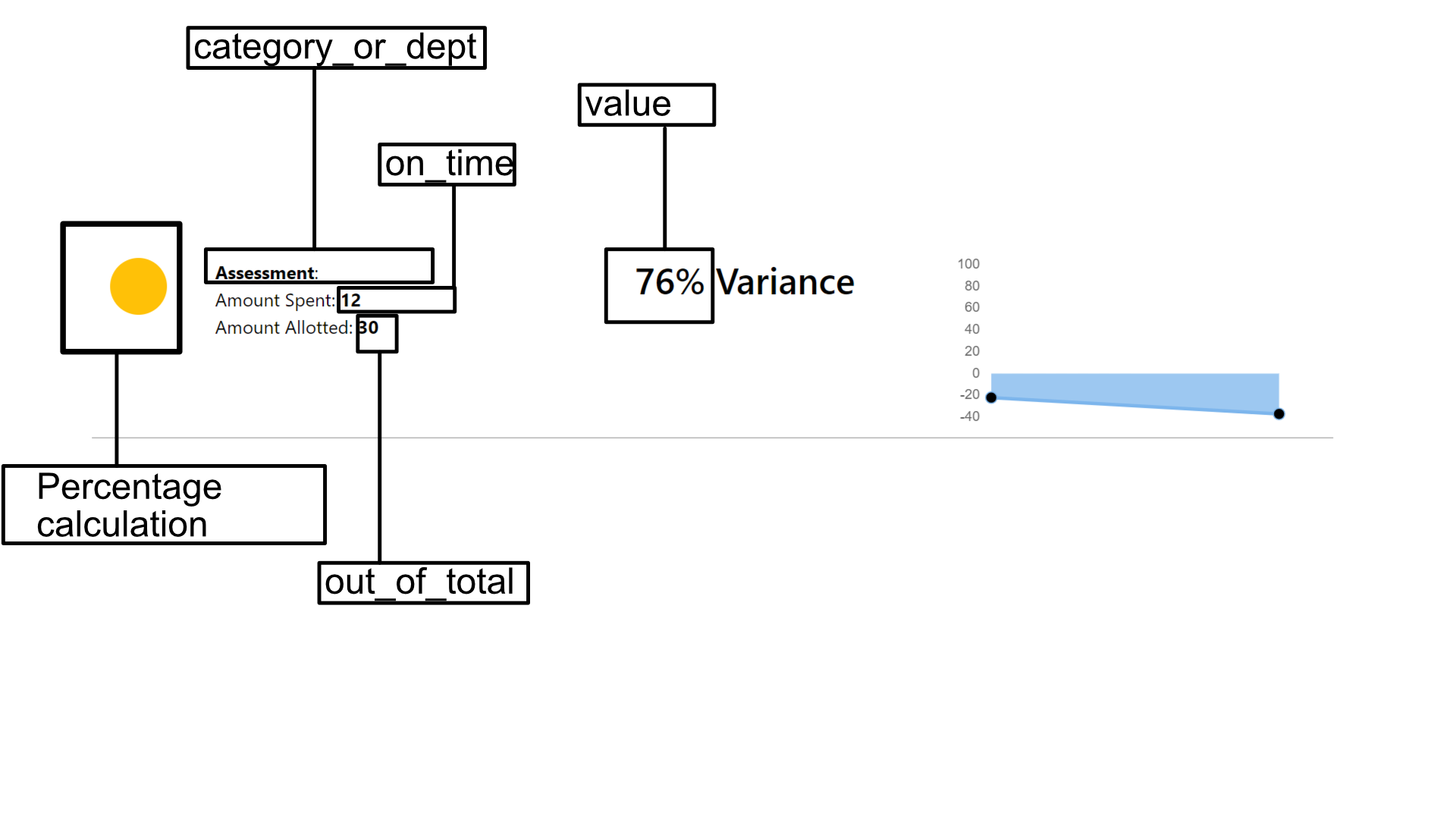
Note: there are no color or movement fields. Also, category_or_dept is the department the field is for. “variable” is what we are measuring. “value” is our percentage value. “on_time” is the amount of money that has been spent. “out_of_total” is the amount of money allotted. A JavaScript script fetches that data and interprets it and fills it into the HTML template.
This is from the combined_percentage_data.csv https://github.com/CityofSyracuse/PerformanceDashboard/blob/master/data/combined_percentage_data.csv
 This page is a demo that shows everything you can do inside portfolio and blog posts.
Extended key result financial data:
There are key result points that stray from the norm and have extended financial data with them, these are Fiscal Objectives.
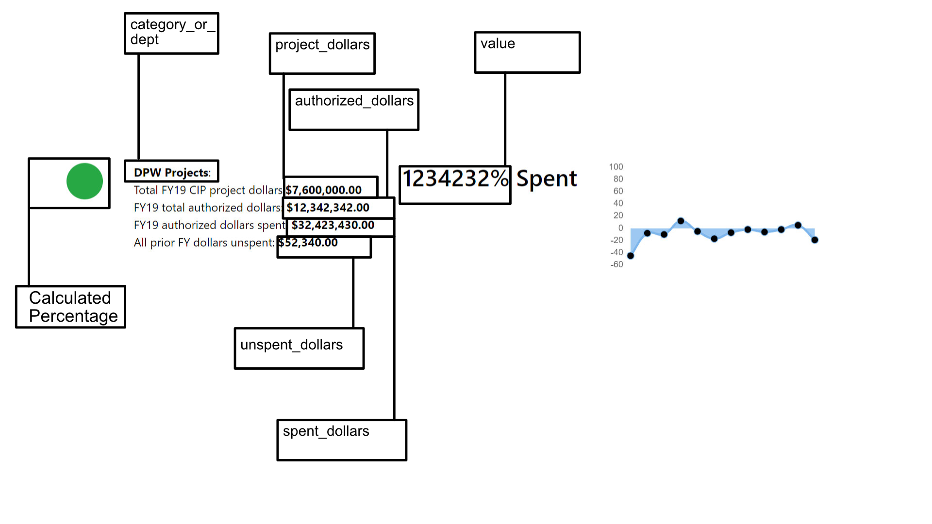
Key result paragraph data:
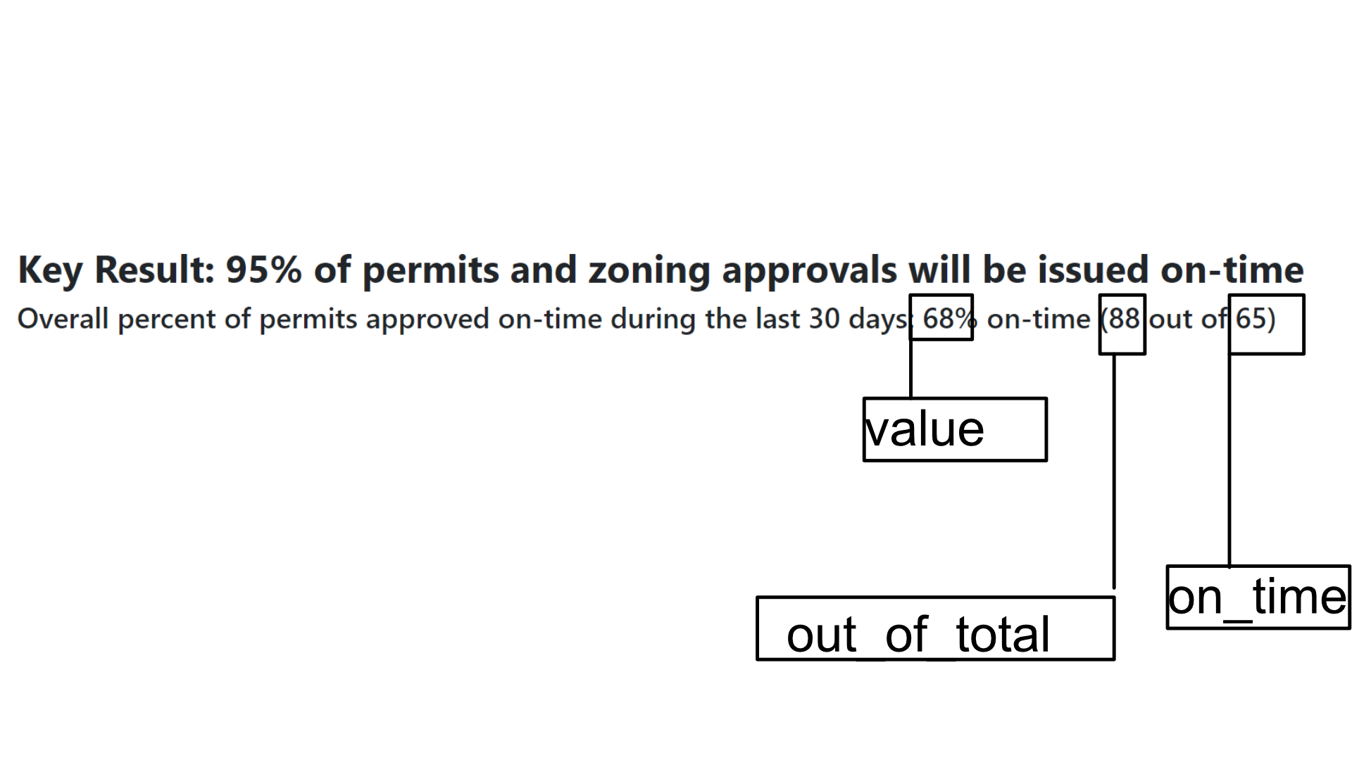
For each objective page there are key result banners that appear before the specific data points. These are summations for the category. This data is in a keyResultBannerData.csv.
The charts data:
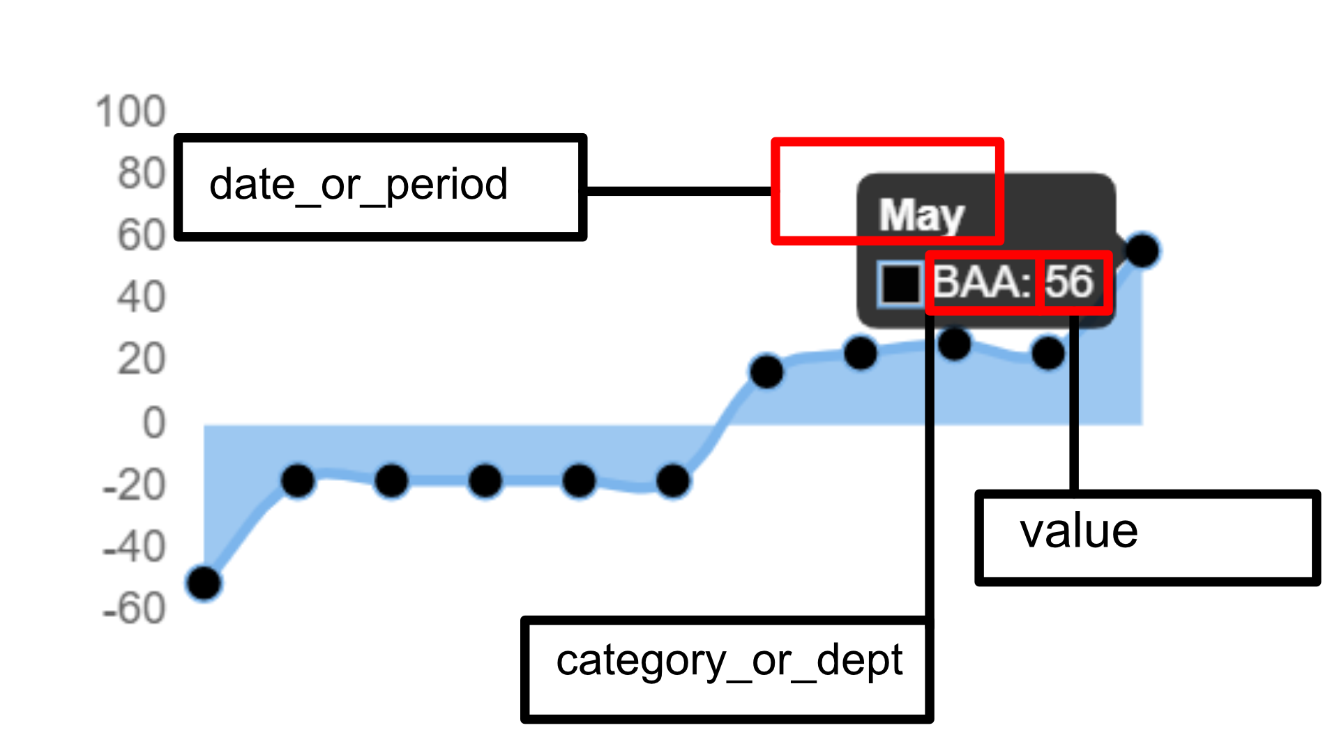
The charts are loaded in from the combined_data_v4.csv. It has some unique values compared to the other data structures. OKR, date_or_period, category_or_dept, variable, value.
The value of date_or_period is the numbers 1-12 corresponding to the number of a month. OR, if the value is outside 1-12 it may be a UNIX time stamp to indicate an exact day.
The file can be found here: https://github.com/CityofSyracuse/PerformanceDashboard/blob/master/data/combined_data_v4.csv
A JavaScript script fetches that data and interprets it and fills it into the HTML template.
